EVBox mobile application design

EVBox Mobile App

EVBox is a cutting-edge manufacturer of electric car charging stations. Their stations come with a management software for the owners of the stations and a mobile app for the end users of the stations. EVBox is on a mission to help transform our world’s fleet of cars to electric. 

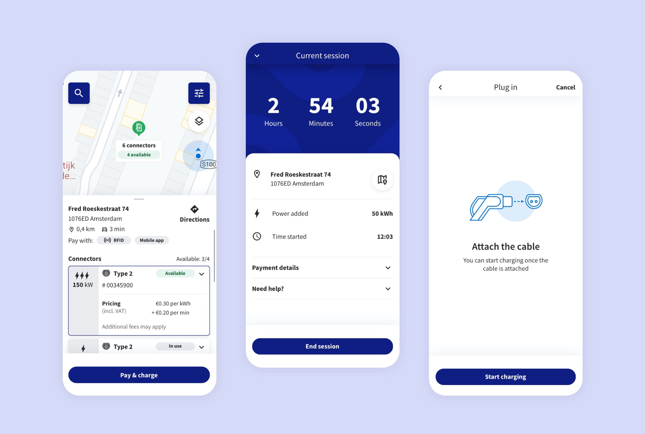
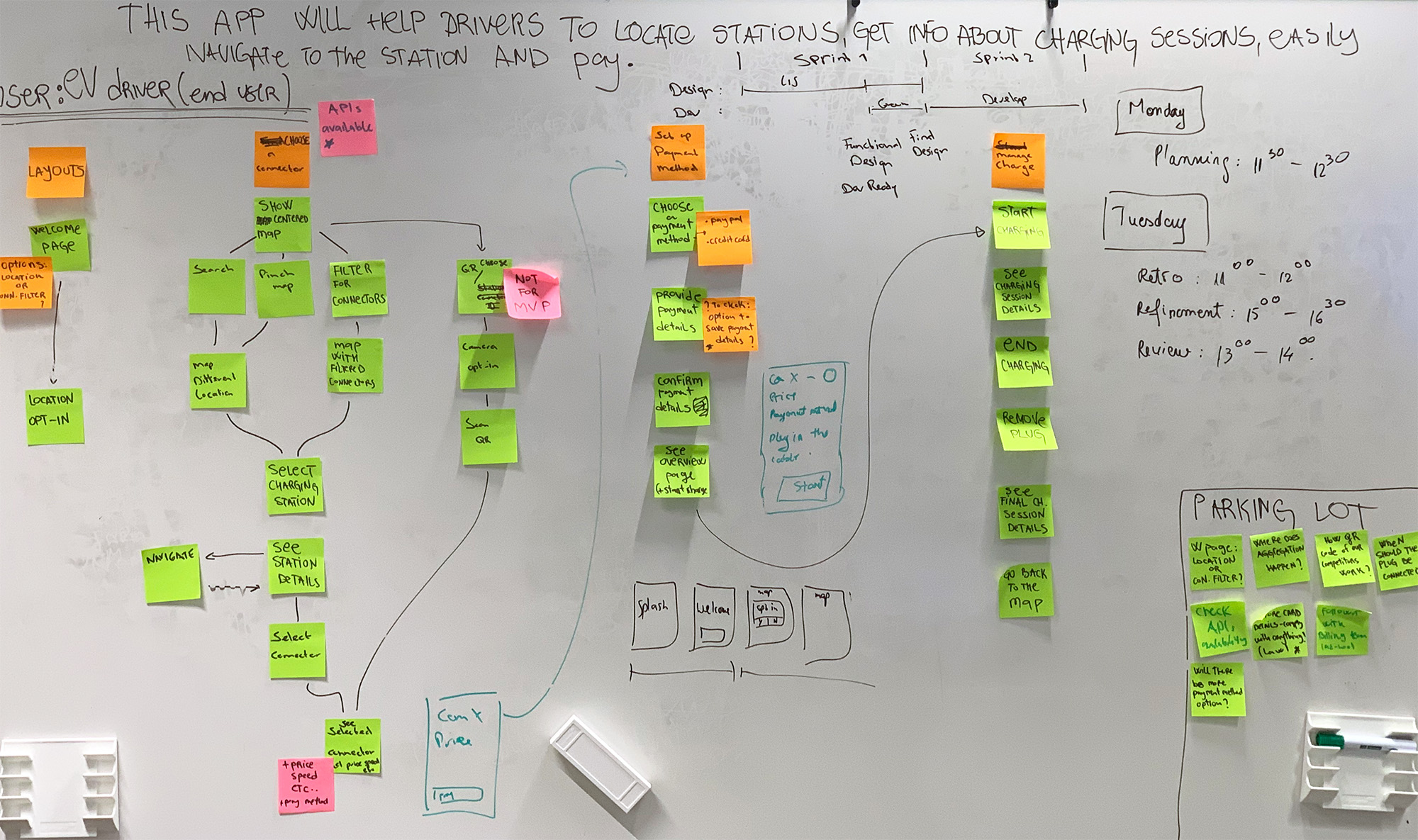
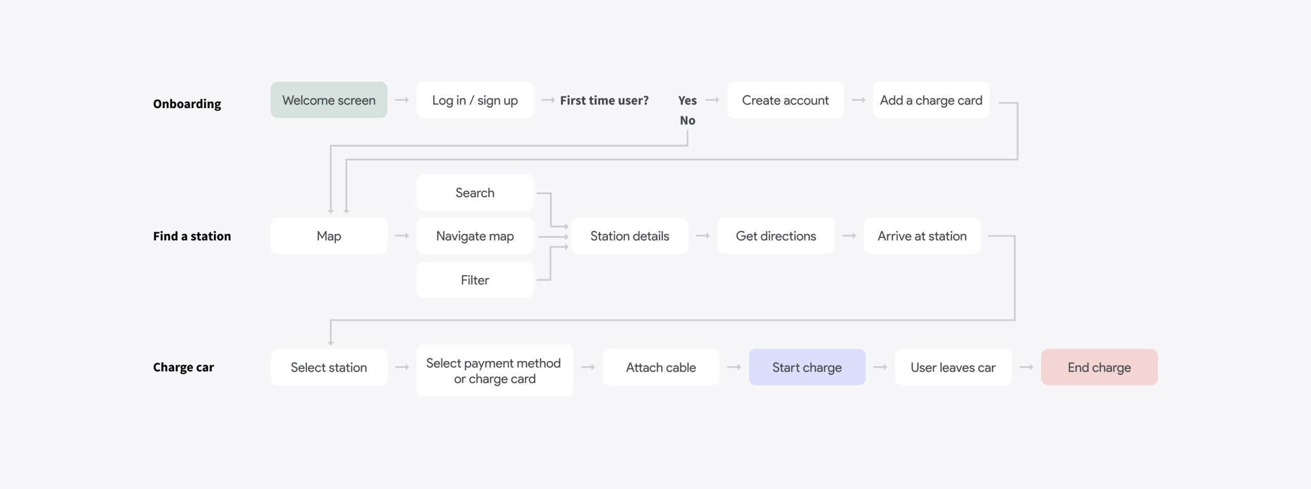
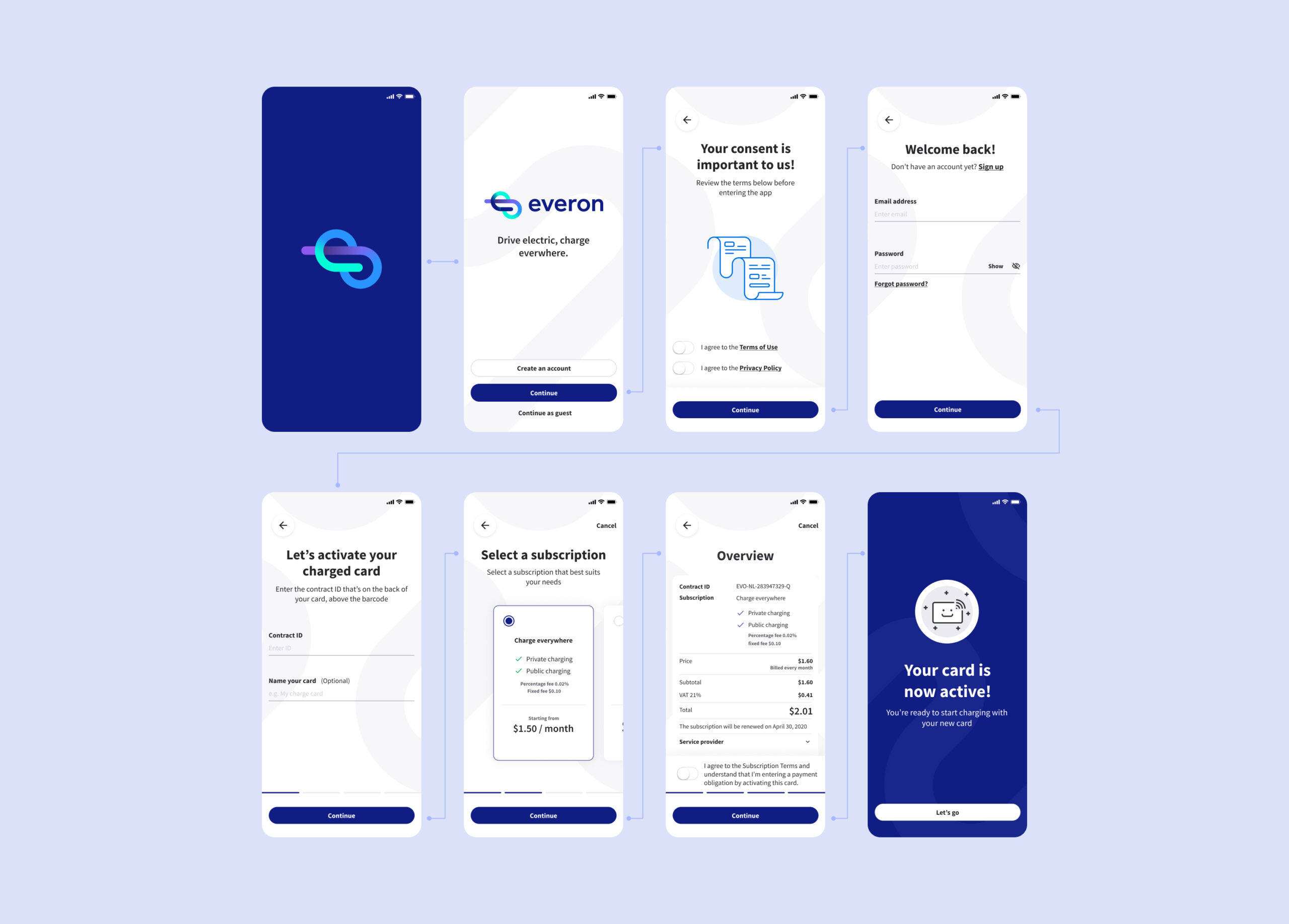
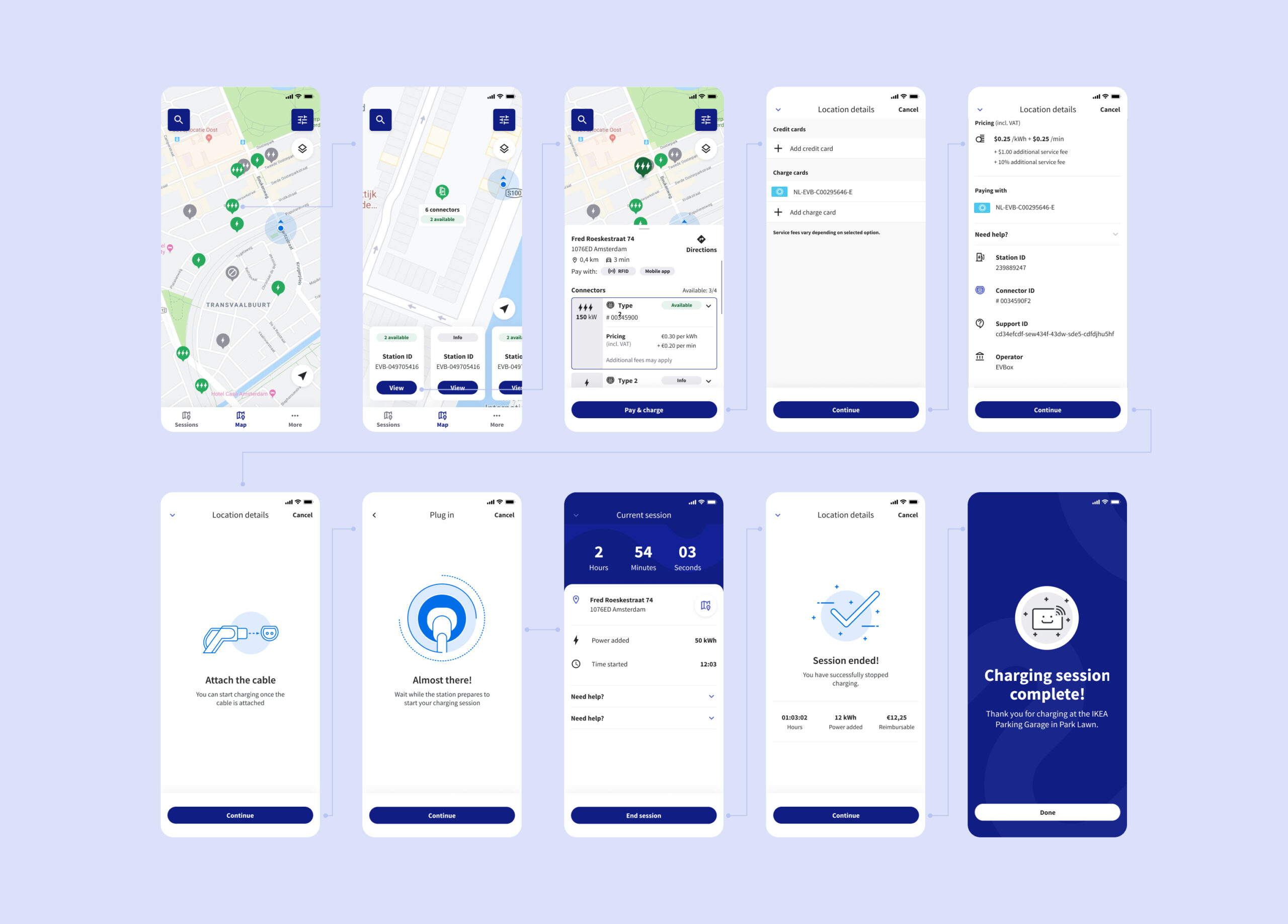
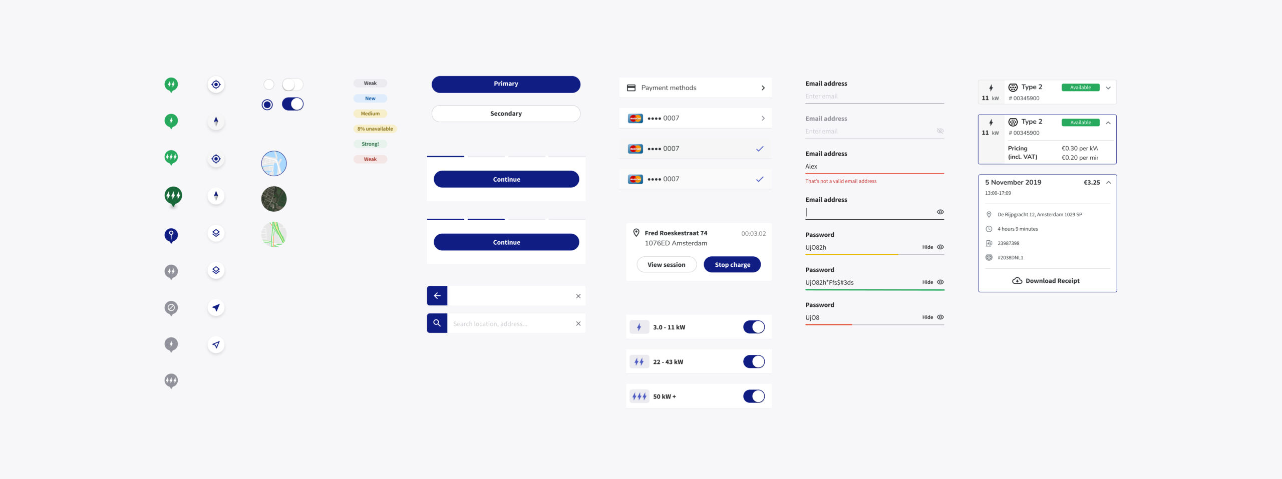
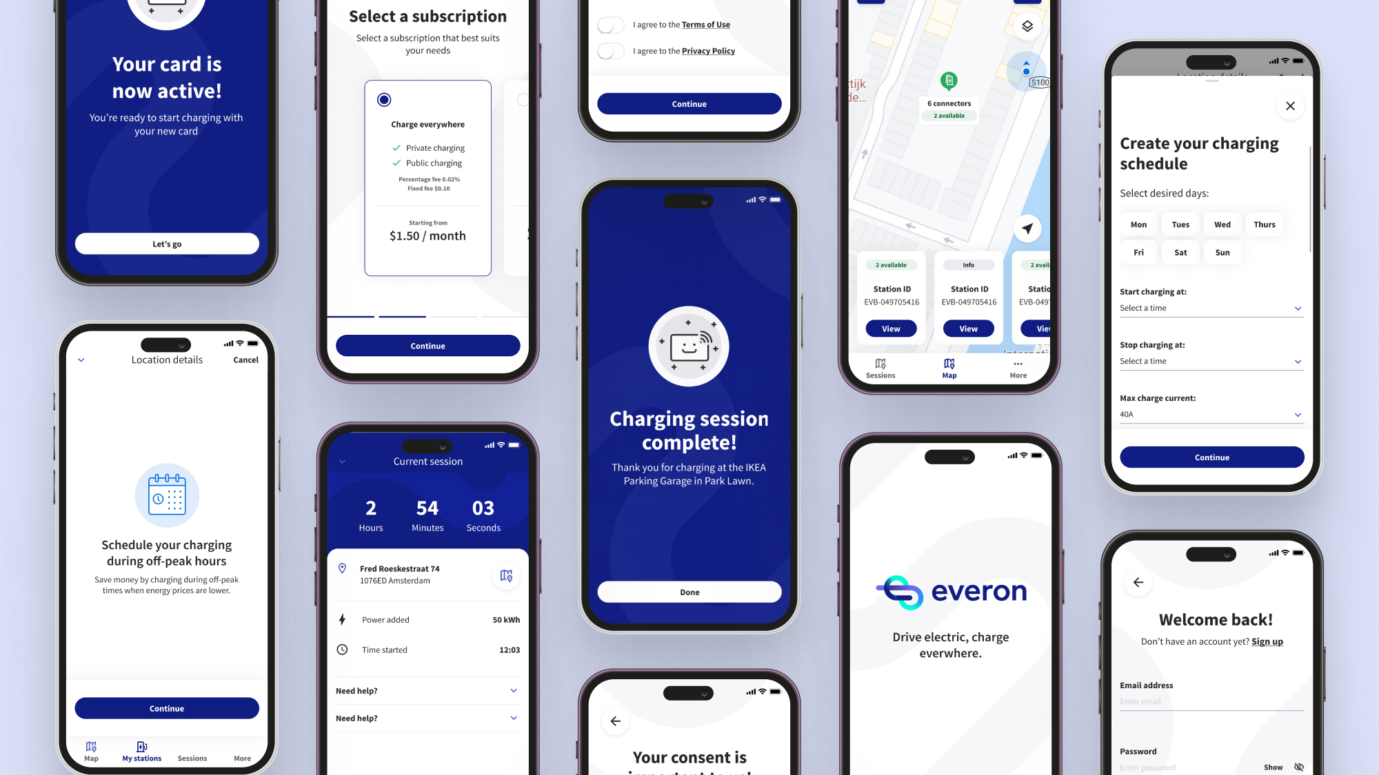
As a part of the EVBox design team, I helped bring this app to life from the ground up. As the lead UI designer on the project, I designed all screens including onboarding, finding stations, charging and paying. We hosted several rounds of user testing sessions and built the design system from scratch. The iOS and Android apps are now available on App Store and the Google Play store.

Everon Mobile App Charge Flow

Problem

Electric Vehicle drivers with EVBox home charge stations and EVBox charge cards need a mobile application to remotely manage their home station and check the status of their charge, but also be able to quickly find charge stations that accept their charge cards. It is also important for them to be able to plan their trips ahead of time to reduce range anxiety, which occurs when an EV driver fears their battery will not make it to the nearest charge station.

Solution

EVBox offers a mobile application, which is tailored to their customers, helping them find charging stations that will accept their charge card. They can filter by the type of plug their car accepts and the amount of power at the station so that they know how long the charge will take, helping them to plan their journey and get directions to the nearest station.

User journey map

At the start of the project, we spent two days in a room with a whiteboard and a pack of post-its outlining all of the paths a user could take in the app, then translating each step into a user story. The following is the happy path for the main flows in the app from the whiteboard session, followed by a simplified, higher fidelity version.

UX post-it session
EVBox mobile app user journey map

Design

We ran several rounds of user testing on our first prototype with lower-fidelity UI. After iterating and confirming that our flow was clear, we began a round of visual refinement to define the look and feel of the components. We slowly began building each screen that we had outlined in our user journey mapping session.

Onboarding

The onboarding flow happens the first time a user opens the app. This is usually right after they receive their EVBox charger and charge card. The app is where users will be able to manage their station and start sessions with their card, so activating their charge card is an important step.

Starting a session

When the driver is ready to go out into the world with their charge card, they can use the app to find which station they will use at their destination or along their route. They can get directions and start the charge from their app when they arrive.

Adding a charge card

When a new user signs up for an account, part of the process is adding a charge card to the app. This means that they can start a charging session on their card via the app.

EVBox Design System

Simultaneously with the app, the B2B charging software needed a new visual look along with a design system. The web platform was EVBox’s main software, so it was important that it looked in line with the new mobile app. The following is a layout presented to the head of product about how the future of EVBox could look. We implemented this design while collaborating with the product team to build the EVBox Design System.

EVBox mobile app components